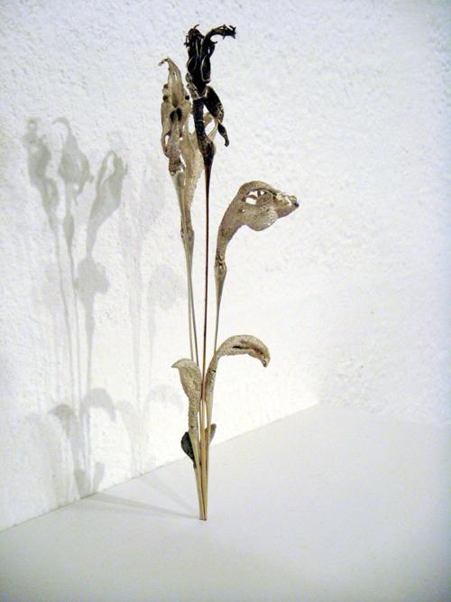
A cluster of exhibitions I visited recently in Adelaide left me pondering on the place of text and the poetry of placement. The artists in Shades of the Real are graduates of Adelaide Central School of Art. All have developed distinctive bodies of work: 'variations which give a nuanced interpretation of tonal painting, repudiating its implicit bonding with realism' according to curator Margot Osborne. The title articulates the works as a range of attenuated shades, each marking out a point of departure from its referent: a swatch chart of potential between the poles of abstraction and realism. Installed evenly, the works operate effectively as exemplars: a paced collection. So the title fits the installation, yet its comfortable surety left me disappointed. What I had expected (in light of previous shows from several of the artists) were shades of the 'Real' as the term is ubiquitously used in reference to Lacanian theory. That is, I expected to be dis-comforted. In The Return of the Real, Hal Foster describes this effect as a delayed replay whereby a subjectively unbearable 'real' is both screened and re-produced: echoed in a confusion of subject and world. In Shades of the Real, this troubling and touching double effect was palpable only in the paintings by Rachel Smyth: a portrait of a young girl standing in a hallway set beside two tiny canvases. Painted conventionally, these were unconventionally composed: two women caught out, both captured as if in a snapshot of subtle movement (isolated within their separate frames across space and time) turning or stirring recumbent. Titled Fallen, the tiny paintings suggested an un-represented common scene: recasting the exquisitely painted portraits into an uneasily eroticised, theatrical mis-en-scene.
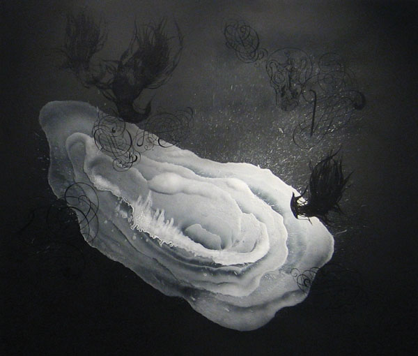
Across town, I saw Christian Lock's new work, at Greenaway Art Gallery. In this show, paced placement operated to evocative effect, allowing the subtle layered surface differences across the canvases to register, shift and fall away in passage. Ambiguous shapes appear in these works as if frozen in an eternal flux: fluid floods, drifting tendril-like filaments and amoeboid forms morphing into (or out of) washing blushes, motes and motifs. Pigment spatters and fading, translucent blooms float suspended along with clutches, tangles and arabesques of highly glazed pattern fragments: shimmering notations appear and disappear as the light catches their contrasting sheen from different vantage points. The paintings are dreamy contradictions: quietly, calmly cataclysmic. Brushstrokes are lightly held in veiled, mute fields of colour or built upon boards leaving exposed holographic grounds glinting brilliantly through inky shrouds of layered resin. In the catalogue essay, Wendy Walker describes Lock's methodology as one of sampling: blending and remixing, drawing across the iconic and material paraphernalia of both surfing and painting. Linking a literal with a discursive taste for the perilous exhilaration of sublime experience, Walker cites Lock equating 'his visceral gestural markings with the swooping maneuvers of the experienced surfer'. Surfboard and canvas both recall by association a certain experiential rush, also the solitary, incremental perfecting of technique: a history of labour that the rush belies. Moving around the installation a meditative effect echoes content in form as the flooding screens evoke shifting associations: free-floating reverie and shimmering surface mingle uneasily with the suggested tumult and drift of drowning. Oblique titles further unsettle, suggesting specific, slightly ominous and altogether unavailable narrative content: Too Good to Tango with the Poor Boys&One Sheet of Strawberry Fields, One Black Caravan, One Last Coffin Ride ...
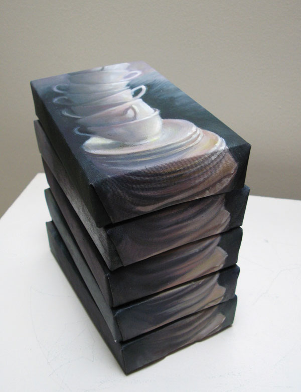
Similarly evocative were Kaylie Weir's paintings in Noodle and Simone Kennedy's Learning to Speak at Artlab. Weir and Kennedy, like Lock, present a sampling of sorts, both draw on intensely personal and ambiguous iconography, obliquely yet succinctly juxtaposed. Weir's arrangement of the paintings emphasizes their nature as objects: stacked collections ordered and re-ordered as if in syntax. A mute language is emphatically articulated through difference in scale, painterly treatment and the repetition of content in form. Motifs are repeated across the collection, a series of dogs and precariously balanced columns of teacups the most insistently recurring: intimations of the markers of domesticity. Placed on a mantle shelf two tiny black and white paintings depict a dog apparently in a suburban backyard: the size, hazy glazed depiction, and placement all resonate to suggest old family photos. Similarly tiny, a tenderly depicted single cup, a still life in miniature, is further dwarfed by a looming, much larger, lush and strangely portentous painting of teacups viewed as if in zoom mode. Titled respectively Baby Cup and Cup Size the paintings present a wry pun evoking the overbearing ripeness of the maternal body. The elaborately ornamented and ritualistically stacked columns conspire in comparison with the simple small vignette to evoke an escalation of desire. Adjacent, several small paintings, each depicting a teacup stack set against a moody green background, are installed one on top of the other. The paintings continue out-of-frame on the edge of each canvas: reforming on installation into a tower of saucers, a curious and compelling illusion. The subject matter depicted is thus both echoed and screened, suggesting an energetic displacement of inappropriate emotion.
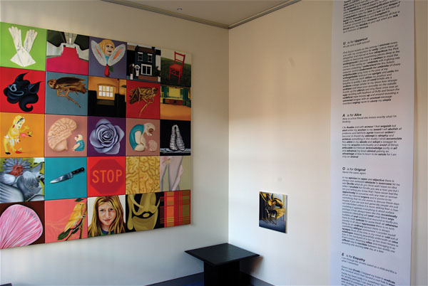
Simone Kennedy also uses text and formal structure to echo, screen and modulate the syntax of her visual language. Learning to Speak comprises a grid of paintings. At first sight, this is a random collection of unrelated images, bugs, hallways, houses, a girl's wincing face, a stop sign. It is flanked to one side by a small solitary painting and a hanging scroll containing an excerpt from an accompanying booklet. The booklet is formatted as a primer, arranged in order to mirror and explicate the paintings as installed...each page bears a letter, title and text...like an alphabet reader only much darker 'O is for Original...V is for Violence...U is for Uppercut'. Each unleashes a stream of unpunctuated prose, set off it seems, by the image to which it refers. With the crystalline precision of a life seen entire in the moment before death and simultaneously unstable, obscure like a nonsense rhyme, dream or nightmare: the installation presents a rebus. Troubling, tender, funny, heart-breakingly poignant and chillingly violent by turn, the images, read along with the text become invested with dense symbolic and indexical cross-reference, triggering an empathetic recognition: a flood of emotion. In conversation with Kennedy, I learn that the text will remain, the related image grid (as the singular paintings that comprise it are sold) will alter, subsequent versions marking an evolution of the original. The project she says, will be recorded on her website. I imagine the grid, with its changing sequence of immutable elements and wonder whether some positions will prove more evocative, more desirable, whether certain constellations of memory and the various string of images that might register their reverberation will be acquired and updated more often, generating a white noise of interchangeable intensity in their wake.

