.jpg)
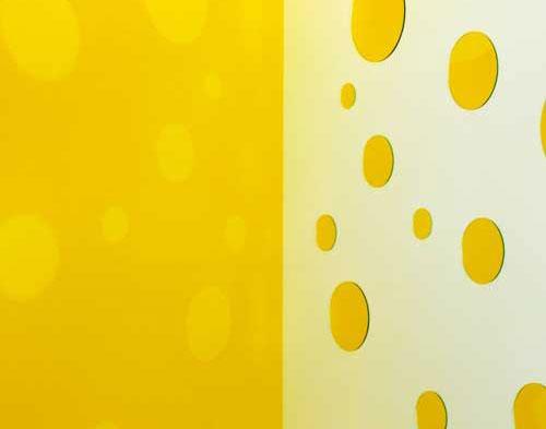
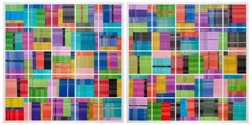
The notion that pollution is responsible for creating more beautiful sunsets doesn’t quite concur with the science. Aerosols soften sky colours, attenuating direct and scattered light, but they also rob us of the intensity of sunrises and sunsets. I was reminded of this when choosing for the cover the detail of a work by the Adelaide-based, Limestone Coast-raised artist Jane Skeer, Retiring the Load III (2018), that is made from the straps used to tie down truck loads. They’ve been handled and they show it with the patina of the exposure to the elements as well as the identifying logistics, dust, oil and grease of the road filtered through the intervening atmosphere.
Like a set of designer swatches in drive-by, ideas of local colour more impactful to manifest than to explain, gently nudge at the specifics in a variety of ways. These rustic hues could be seen to invoke an image of Cornwall – those smugglers as fellow freight haulers – in a suggestive side reference to a line of descent common to many South Australians. The focus on re-use, a guiding methodology for Skeer, also makes palpable the human footprint, the traffic in consumables as this textured skin of commerce, like those islands of unbiodegradable plastic wrap that clog our oceans and waterways.
Just as an earlier generations of artists took forthright strides into the modern world to make use of the readily available colours in a tube, a tin, a colour chart, inspired by the plastic and chrome-metal finishes, the concrete, metal and curtain glass of built spaces, it is the environment that shapes us. In a lineage that can be traced from the phenomenological observations of Johann Wolfgang von Goethe’s Theory of Colours of 1810, through to Donald Judd, Olafur Eliasson and James Turrell, this negotiation of human presence is also a form of mindfulness.
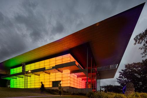
Colour theory got more interesting when we ditched the hermetically sealed universe of the colour wheel, the colour system as a hierarchy of pure spectrum hues and tonal values ingrained like the law in a dense network of relations. That the entire fate of Western culture is somehow bound up in unpacking this system captured in the grey world of the chiaroscuro effect and its attendant mystic origins in darkness and lightness or whiteness is a central tenet of David Batchelor’s Chromophobia (2000), liberally quoted across these pages to provoke an expansion of the terms of reference. Batchelor, the art world’s most provocative colour advocate, who recently visited Melbourne as a guest of the University of Melbourne and the RMIT, has through his own art consistently cited his attraction to artificial, electric and petrochemical colours as a fact of contemporary life.
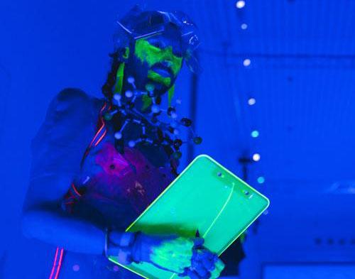
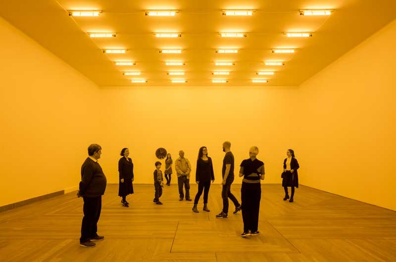
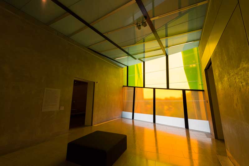
As registered in the work of Debris Facility, featured in this issue in a conversation with Tessa Laird, it is no longer possible to distinguish the base hues from the “junk” colour of the world. The Facility, donning this toxic skin as jewellery in the expanded field is both trash collector and chamaeleon, “dragging in” the local colour, also as successive wave lengths in flushes of colour that pass through the digitally mastered world of screens and neon. Liquid, like the flow of light through architectural space, it is an experience also enjoyed by those joining the party for Night Life with James Turrell (at QAGOMA in Brisbane), walking through Rebecca Baumann’s Window Work (at the Ian Potter Centre, NGV Australia) and in reflection on David Sequeira’s Fugue (recently installed at Gertrude Glasshouse) as some recent examples.
The task of rejuvenating colour values and rethinking social and art-historical exclusions is all across these pages. Amelia Wallin considers feminist histories, with alternative goals and working methodologies that expand the discipline and field of practice in the work of Emily Vanderpoel, Hilma af Klint, Becca Albee and Claire Milledge. Abbra Kotlarczyk, a curatorial collaborator with Madé Spencer-Castle on the multi-site Queer Economies project in Melbourne, discusses how colour has been taken up and reclaimed as a symbolically latent form of cultural signification for LGBTQIA+ people through the work of Callum McGrath, Carlos Molta, Frances Barrett, David McDiarmid and Peter Waples-Crowe.
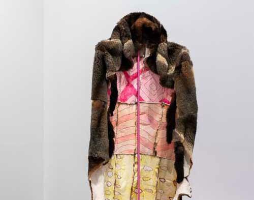
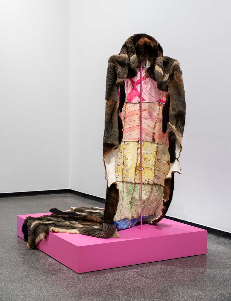
The rainbow as a “beacon of strength” and a “site of resistance” embedded in the soft enveloping folds of Waples-Crowe’s possum-skin Queer Cloak of Invisibility (2018), recently exhibited at the Australian Centre of Contemporary Art, is an example of this diversely intersectional and transcultural phenomenon that is both celebratory and survivalist in its prompts. Colourful like the rainbow serpent, Waples-Crowe’s work keeps the colour on the inside in an inversion of the vivid palette of Albert Namatjira’s mass-reproduced watercolours in the Western style, these western desert arcadias that made their way into white suburban households in the 1950s and 1960s to also invoke perhaps some of the contradiction of Australia’s assimilationist policies.
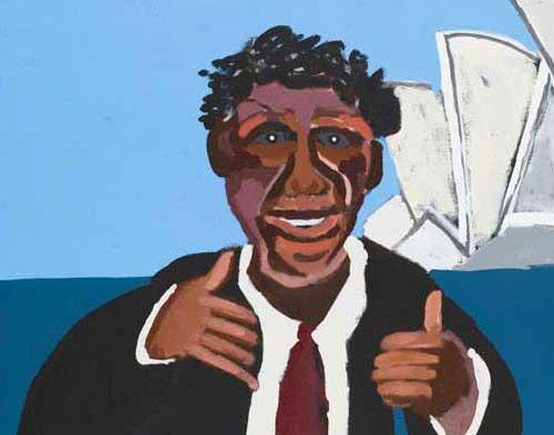
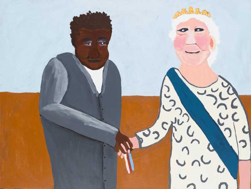
Namatjira’s legacy, vindicated in the recent conclusion to a shamefully long-drawn-out copyright case that has finally restored ownership back to his descendants, also continues to evolve in the fluid reinterpretation of this vision of the landscape picked up by subsequent generations of artists from the Western Arrernte. Reconsidering the legacy and the possibilities of reconnection, in this issue Wes Hill champions the recent work of Albert’s grandson Vincent Namatjira, and the significance of Vincent’s bold move to turn the spotlight back on the subject of Albert’s life, embracing an optimistic candour in the storytelling in his series of Albert’s Story (2014) that includes the artist’s meetings with the Queen and other heads of state, and the contradictions of celebrity during a period when Aboriginal people lacked basic citizenship and civil rights. These and other works form a distinctive repertoire of hand-painted storyboards, portraits and galleries of authority figures from both sides of the racial divide, to highlight as Hill concludes that “Vincent sees just as much artistry in his great-grandfather’s manoeuvring between white and black worlds”.
Back on the Kaurna lands of the Adelaide Plains, Uncle Lewis Yarluburka O’Brien and Ali Gumillya Baker from the Unbound Collective draw further inspiration from the presence in the sky of the “homeriver Wardlipari” that is the Milky Way where Yurakauwi the rainbow serpent is known to hide in the dark holes: “We speak of Kaurna Yarta, of the many colourful sands of the Southern beaches and the gendered rainbows, of places where the whales come to die: Tangkakilla, smelly place. We speak of peacemakers and firekeepers, ancestors who are spirit birds, Tjilbruke. We speak of the ongoing racism and the environmental destruction of the planet ...”
“What colour is the sacred?” Michael Taussig framed the question, casting his anthropological gaze back upon the prohibitions embedded in Goethe’s frequently cited remark in the Theory of Colour “that savage nations, uneducated people and children have a great predilection for vivid colours”. To this, Uncle Lewis and Baker respond with a further rhetorical question, “What is the colour of our collective intergenerational grief? Is it the colour of the grey concrete across Tarndanyangga [Adelaide], the concrete used to make the wetlands of the earth into drains?” They confirm, white is “a colour of mourning and death in Kaurna culture, of old bones, salt-worn shells and grief. Lightness and enlightenment speak both to knowledge gained and what we have collectively lost, of old exclusions and recent insights. Grey clay goes white, white clay for death, our colour for grief is white.”
.jpg)
.jpg)
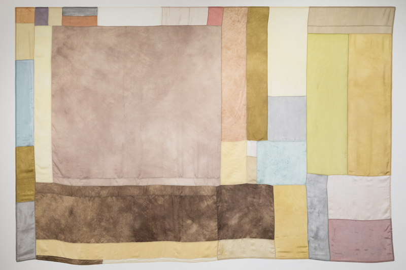
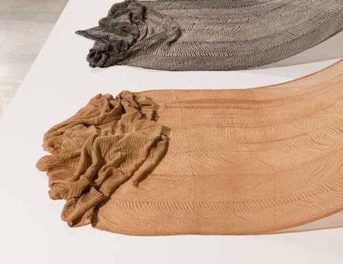
As just a selection of the diverse registers of thought and practice covered in this issue, I have left for last an alternative view of art-making that also can be viewed as a form of restorative justice. Julie Ewington’s opening feature essay responds to an exhibition that was one of the inspirations for this edition of Artlink, and from which we pinched its name. Local Colour: Experiments in Nature, curated for the UNSW Galleries in 2018 by renowned weaver and educator Liz Williamson, addresses in Ewington’s synopsis “the twinned subtlety and intensity of natural dyes married to cloth and fibre, ancient practices being revisited and revised today. Contemporary artists and community-based artisans with generations of knowledge are everywhere experimenting with natural alternatives to industrial chemical dyes and addressing urgent questions of environmental sustainability.”
Profiling twenty-one artists and collectives from Europe, North America, India and Australia, further enlarged by an accompanying discussion of Indigenous and Pacific artists contributing to Women’s Wealth, featured in the 9th Asia Pacific Triennale currently showing at QAGOMA, these works of stretched, hanging, standing and softly falling woven, felted and dyed forms in (mostly) lightweight materials capture as Ewington has also remarked upon “a distinguished palette” of intense but restrained soft hues, recalibrating our eyes to the mid-tones and a world of softer tincture and material resonance rooted in the ephemerality and distinctive palette of hues made from leaves, roots, barks and flowers.