As Geoff Parr suggests in his catalogue essay for this show, potential associations for the word 'green' are widely divergent. Even ten years ago, if ‘green’ had come up in a psychological game of word play, the most common response may have been ‘grass’. These days I’d suggest that our brains track a regular path towards ‘sustainable’ or ‘power’ or more cynically, ‘washed’, so it was an interesting surprise to navigate through the selected works in 'GREEN', unfurling a list of other possible interpretations and perceptions.
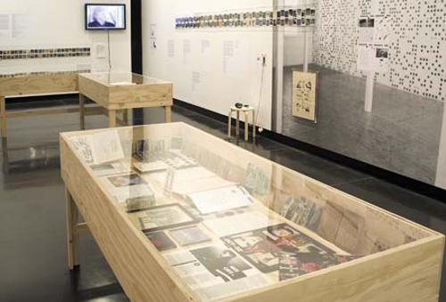
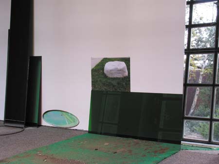
Bec Stevens’ ‘green’ in 'Faster, Stronger, Greener' could be translated as nature with a question mark. Her three dimensionally collaged installation of photographs and objects reflects an artist navigating carefully through local space, picking things up and turning them over, enjoying the way we attempt to recreate ‘nature’, while real nature is quietly and relentlessly reclaiming any gains. As in nature, there is a kind of structured chaos to Stevens’ arrangement, with pieces of work literally or visually colonising the wall, floor, adjacent windows and garden beyond like a creeper.
Richard Giblett’s ‘green’ is a sickly coloured light emanating from the basements of an imagined city. On a broad table, a scaled city is built in blonde wood. Populating 'Subcity (while you were sleeping)' are buildings reflecting various architectural movements, including a tiled sphere dominating one corner like a world expo landmark. Looking closer, things aren’t quite right. Buildings and levels shift such that streets aren’t continuous and through the cracks emerges a green light, like the glow of a power source or something far more sinister.
A person placed on unfamiliar ground is a little ‘green’. Lucy Bleach’s quirky installation 'Greenhorn' did just that with a number of highly skilled Hobart professionals. Her greenhorns sat in the Hobart Town Hall carving into green floral foam to make contributions to a wall of bricks incorporating the relief of an espaliered fruit tree. A video - overlaid with the persistent squeak of foam under the knife – shows the carving and the conversations created as a result of this odd circumstance.
Both Colin Langridge and David Haines infer ‘green’, without using the colour. Langridge’s serene plantation of sculpted poplar boughs suggest a process of budding growth through their bulbous shapes emerging from slender, carefully balanced trunks. His statement notes that his ‘green’ is the chlorophyll promoting growth in plants and in doing so, masking other colours. He draws analogies in this statement to transformative processes in human life and creative activity. Haines is interested in the frequencies of aroma and his ‘green’ is communicated in a series of scents that mix a range of ingredients from cut grass to bong water. Testers pre-dipped into clear concoctions from clear jars fill the immediate area with heady aromas that make the mind flick flack between its stored memories of occupied natural spaces. Some time later, I wonder why there is so little work with aroma in art as the scent of Haines’ work – particularly the note of bong water – persistently clings to the pages of my notebook.
Providing each artist with the same, simple, one word brief has established a satisfying show that demands an investigative eye. In each case we must ascertain the way an artist has interpreted the word and in doing so, track a neurological pathway. One artist heads laterally to humour, another to something sinister, while others dive headlong into the natural or use it as a foundation for an intellectual analogy. Irrespective of intention, the show does something to reclaim the word ‘green’, cleaving it, if only momentarily, from its use as a fraught coverall for sustainable solutions or political movements.

