.jpg)
If we say anything can be art, as we now so often do, we immediately run up against a needle in a haystack sort of problem—exactly which “anything” is art? If anything can be art then effectively nothing is art, not even “art”. We can try to narrow it down by using particular definitions but the problem persists.
My personal definition has long been that the reason we value the artefacts we call art is because we recognise their role in the process of human cultural adaptation in a constantly changing world. This is what Donald Brook calls “memetic innovation.” Usually those artefacts are traditional paintings or sculpture but that is simply because they were the most widespread forms of media until the late nineteenth century when the art business settled into its present formation. But the most significant and innovative examples of cultural adaptation are no longer produced in those media, they can be in any media or technology, and no longer necessarily described as art nor made by people who call themselves artists. This leaves the artworld as we know it as a sort of stranded asset, scrambling around for relevancy as its gatekeeper role is bypassed. To the degree that the traditional artworld now has any validity it is as a legacy social space where these issues can be discussed. But that doesn’t solve the needle in a haystack problem. What should we be looking at and discussing? How do we define what is culturally significant and where might we find it?
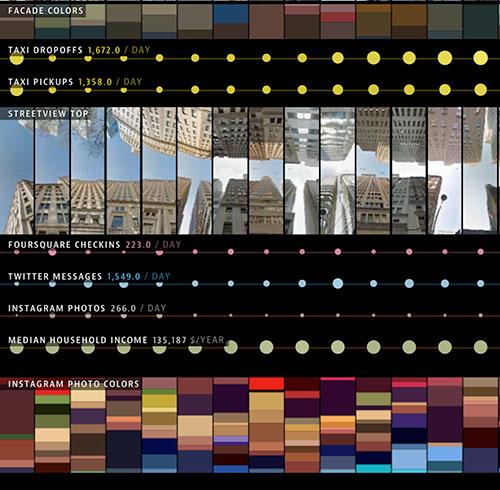
Data visualisation has turned out to be one of the most accessible areas to go looking. When Eve Sullivan approached me about guest-editing an Artlink issue on data visualisation I was excited about the opportunity to discuss where visual culture is headed. Data visualisation is only one of many developing genres currently straddling the borderland between art and non-art; or rather, the area where art is simply an irrelevant category, but its growing institutional acceptance makes it a valuable bridge into other areas of expanding significance. The unambiguous imagery and format of data visualisation means that it can be seen as the portraiture or topographical landscape art of our time, even if it portrays a data landscape that is usually invisible.
.jpg)
We set out within the limitations of one magazine issue to outline the effect of big data and data visualisation through some history, current work by artists who have used data in a variety of ways and the innovative use of visualisation in other disciplines. We could have filled the magazine many times and what I learned from editing this issue is the degree to which big data has become click bait in supposedly serious media.
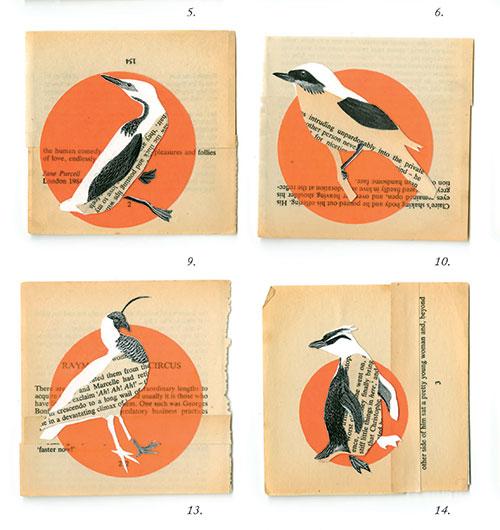
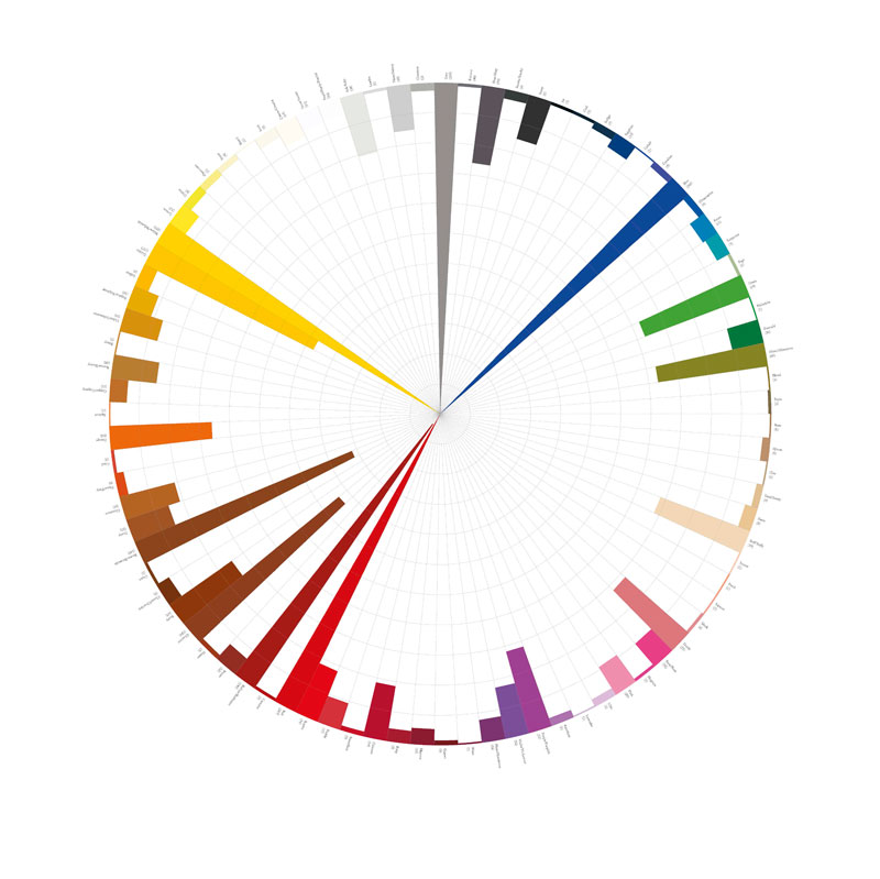
With hindsight the rise of data visualisation is no surprise. There is a clear history of data visualisation parallel to the history of science. Carl Linnaeus’s development of scientific plant taxonomy in the early eighteenth century could be regarded as the first genuine example of big data and his techniques have become the principles of data structuring, integrity and normalisation that analysts use to this day. But less scientific poetic categories also continued, with Goethe’s colour wheels fifty years later speculatively associating prismatic colours with symbolic qualities—for instance, green equalling harmony, Biedermeier culture as middle-class values of usefulness. Zoe Sadokierski and Kate Sweetapple explore similar whimsical categories in their work Unlikely Avian Taxonomies, profiled in this issue.
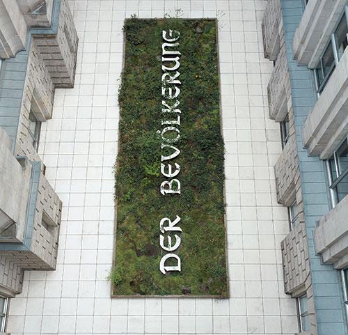
Nineteenth-century publishing developed an insatiable market for these graphs and illustrations. The innovative diagrams in the works of the engineer Charles Joseph Minard have led to his recognition as the first great artist of data visualisation and his map of Napoleon’s catastrophic 1812 Russian campaign as its first great masterpiece. The political potential in presenting data as diagrams was soon exploited. The radical American sociologist, historian, civil rights activist William Edward Burghardt “W. E. B.” Du Bois used graphics widely in his books and campaigns. The infographics that he developed on black life since the end of slavery for the “Exhibit of American Negroes” at the 1900 Exposition Universelle in Paris are the distant forerunners of Diller Scofidio + Renfro’s EXIT 2008–2015.
.jpg)
Many forms of data are far more useful as visualisation. For instance, following the Second World War the need to visualise weather patterns became a major driving force of computer innovation in Australia. As Stephen Jones explains in his book Synthetics: Aspects of Art and Technology in Australia 1956–1975 the development of different output and display technologies began a reciprocal process where the engineer could inspire the artist as much as the artist could inspire the engineer.
The documentation that was common in early conceptualism was the beginning of data visualisation in mainstream art. Given that “reality has a well-known liberal bias,” as Steven Colbert said, it was inevitable that much of it was politically radical. Hans Haacke’s work documenting the intersection between art institutions and the less admirable activities of wealthy benefactors has been both iconic and politely ignored. Chris Nash discusses the melding of the two disciplines of art and investigative journalism in Haacke’s early and more recent work and concludes that “perhaps [the] most profound lesson is that art, as data visualisation, has to be understood as practice—practice on the part of the artist and practice on the part of the diverse audiences. Reducing art to an object, visual or otherwise, is a severe and crippling limitation on the interpretation and understanding of the work.”
This insight lies at the heart of the great schism in the artworld after the cultural (and actual) wars of the late 1960s and 70s, although that schism remains still barely recognised or acknowledged. The election of Thatcher (1979) and Reagan (1980) began the imposition of neoliberal market-based models of financialising cultural and social activities throughout western societies. While the more conservative artists began to develop institutional commodity and entertainment art the more radical artists began to develop participatory and collaborative practices that integrated with daily life, embedded in ways that made them almost invisible to the art institutions at that time.
Advances in computerisation were to facilitate both the neoliberal model and the participatory model while generating complex and contradictory activities within them. As a result, we now live within enormous data structures that are for the most part invisible to us, managed by equally invisible algorithms. As big data has grown, data visualisation has also developed as a way for us to navigate and interact with these complex other dimensions of reality.
An early response by artists was to anthropomorphise computers, as Diane Mantzaris did in her 1991 print. As the earliest Australian artist using digital technology for printmaking in the early 1980s Mantzaris already had a clear vision of where technology was going—that is, into a world where computers would be more interested in other computers than us.
By the turn of the century data visualisations were themselves becoming the subject of artworks that continued to use traditional media. Justin Trendall’s painting Darlinghurst (2010) is essentially a portrait of the Sydney artworld as a network diagram of artists with galleries and institutions as nodes. Data collection becomes the focus of Agatha Gothe-Snape’s series Every Artist Remembered (2011) as, armed with a pen and a large sheet of paper, she interviews artists using free association to gather random collections of artists names as remembered by her interview subjects.
The US artist Mark Lombardi, whose “suicide” in 2000 was regarded as suspiciously related to his research into corporate criminality, produced more elaborate drawings of corporate networks, many of which shaded into fraudulence. The difficulties he encountered are a salutary warning that data when visualised can be dangerous.
.jpg)
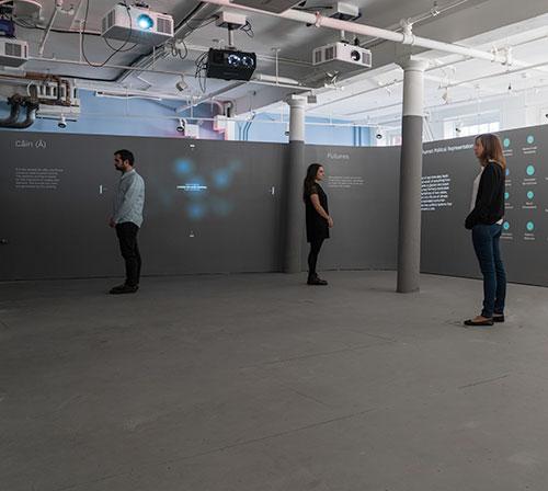
Since the turn of the century, the breakdown in boundaries separating previously distinct disciplines has become a feature of our times, particularly the process of disintermediation, the removal of intermediaries between the maker and the audience. While this has diminished the influence of traditional cultural gatekeepers these forces have also generated new genres. The art institutions have already realised this and there has been an upsurge of data-based shows worldwide.
But even if data visualisation as gallery content is starting to look like the next big thing, that’s no reason to despise it. You can tell from that statement that I am slightly ambivalent about this. But, really, I’m just pre-emptively annoyed at the way some of it will be hijacked. Exhibitions have been popping up regularly, increasing numbers of artist have a data component (real or fictional, static or interactive) in their work. Where will this lead an artworld that already exists on the desktop and your phone as much as in galleries?
Data visualisation has so many characteristics that make it appealing to large art institutions, the shaky arbiters of art legitimacy. Their insatiable appetite for entertaining content has driven the art-as-spectacle industry for decades but that hasn’t saved the walled garden of art. Artists must now compete on equal footing with an enormous range of other cultural producers, image and artefact makers.
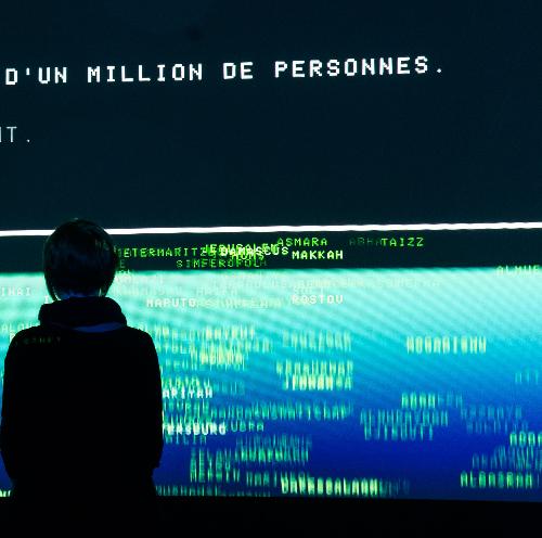
Some simply use data to generate aesthetic effects, an example being the Tatsuo Miyajima exhibition at the Museum of Contemporary Art, Australia. Others use aesthetics to a political end. EXIT, currently on exhibition at UNSW Galleries and then going to the Ian Potter Museum of Art conceived by Paul Virilio and designed by Diller Scofidio + Renfro, has become the global exemplar of data visualisation as institutional spectacle, an impressive and almost overwhelming barrage of statistics on refugees and climate change.
.jpg)
But information wants to be free (as the cliché goes) and even data-based work that consciously acknowledges an art framework now also addresses other audiences as well. In this issue Vanessa Berry discussing her own work tells how it has existed as historical research, blogging and exhibitions and has also inspired data exploration by others.
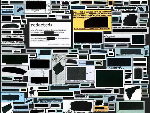
At every stage technological change has been driving the evolution of big data. We all now engage in online interactivity that generates data for corporations that have become some of the largest business enterprises ever seen while nation states are involved in surveillance on a scale beyond anything Orwell imagined. Our every last action is being retained and analysed: our shopping, every email and message, every phone call, every site we visit. Simon Biggs discusses the way artists have responded to this new panopticon. Mitchell Whitelaw is more optimistic about interactive projects and the visualisations they produce—who ever would have expected a council tree database to generate a flood of love letters to street trees? But he also shows how those who would spy on us are not happy about us looking back, producing hilariously redacted imagery in the process.
In the end it is clear we have reached a crucial point in human history. We now live in sci-fi times but not in a sci-fi utopia. Darren Jorgensen explores some aspects of this in his essay in the previous edition of Artlink (Parallel Universe 36:4): “Today, it is impossible to think about art as anything but immersed in the geopolitics of Greenhouse Culture, in which the inability of nation states to manage runaway levels of pollution promises to bring about an apocalyptic future. Even nature, once the most reliable of subjects for artists, has become something very different, appearing almost as manufactured as an aquarium or a manicured garden. But the difference now is that nature is out of control.”
Philip Brophy discusses how this is revealed as Hollywood’s particle diffusion motion graphics convert real-world imagery to data that can then be modified and recreated as an alternative reality, as real as fake news. This software reveals the spectacle of imminent cataclysm that we unconsciously feel lurking beyond our vision without analysing its causes or allowing a response beyond shock and awe.
So if the nineteenth century could be described as the century of romanticism and the 20th century as that of modernism then the 21st is shaping up as a contest between sci-fi and oblivion. The widespread poverty generated by neoliberalism and the fashionable business memes made possible by big data (like AirBnB or Uber) that normalise precarity and immiseration are creating a culture that in some perverse ways resembles traditional cultures, a minimalist material culture balanced by an increasingly rich online intangible culture of songs and stories, conversation, swapping and “making do”. Many of us now live our most fulfilling lives online, with multiple identities in various bubbles akin to clans and sects that have a global membership. We interact, contribute socially, materially and culturally, developing and exchanging material in this spirit world where unseen powers and forces control our lives in a data landscape whose totality we can barely perceive or comprehend.
But does that even matter? Do we even matter? Sean Dockray casts a very cool eye over the position we have now reached, where the data we have collected and the technology we have created is beginning to live a life of its own. The data is no longer collected for our exclusive use or delectation but rather for the use of machines communicating with each other. The invisible data world we only see in visualisations is their natural world. Once this was sci-fi and often bad sci-fi at that, but no longer. For the time being computers live in our world but soon we will be living in their world, little more than nodes and sensors on their network. As Dockray says: “how will we find room to breathe, immersed as we are in ‘algorithmic governmentality’ and ‘data behaviourism’, a truth regime in which the time and space for interpretation, deliberation, and judgement has been squeezed to nothing by a preemptive computational order that ‘bypasses consciousness and reflexivity.’”
.jpg)
Community and location are no longer the same as social media creates international virtual communities and blockchain technology not only creates alternative monetary systems but can also create an identity for each of us more secure than national citizenship. This strange new world, this extraordinary case of bypassing the world’s looming ecological disasters by building a different ecology of machines and information that will be unaffected by the collapse of organic systems, has been creeping up for some time now, yet most people have hardly begun to understand it. Data visualisation allows us to sense its outline through the fog.