tides apart is one idea, one artwork, consisting of two pieces made separately by different artists; each respectfully bound to the other in an elegant installation. Time, contemplation and reflection are the thematic contribution to an overwhelming quietude on entering the space.
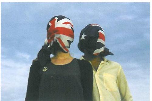
The first clue to the atmosphere of the installation is a seemingly unrelated photograph used for the invitation. The image is of Lapland's frozen terrain with its vast empty landscape and an indeterminate horizon.
The collaboration between Pippa Dickson and Justy Phillips is equally sparse and fragile. The simplicity in their approach to the individual elements is the strongest linking factor.
Their initial ideas for the exhibition engaged notions of remoteness and travel – of horizons and a sense of space, 'especially the personal relationships we all create with specific spaces'. The challenge for the artists was to create an exhibition where those contemplations could be experienced by others.
Dickson's large, unadorned elliptical floor piece controls the space inside the gallery and sets the agenda for a quirky understanding of perspective and 'a picture plane'. It also invites the viewer into the room while providing a platform for sitting and contemplation. Angling the low-set surface plane enhances the distortion of space. The only point of reference to a true horizon is a carefully positioned fluorescent tube of light suspended above.
It's a quiet and confident work that easily encourages stillness and rest. The materials are humble and readily accessible with no pretension to greater values by using rare timbers or sophisticated craft skills. This in itself is a shift away from her usual design practice that demands an intensity of detail and accuracy. The shift to refined simplicity is a direction that sits comfortably with the artist.
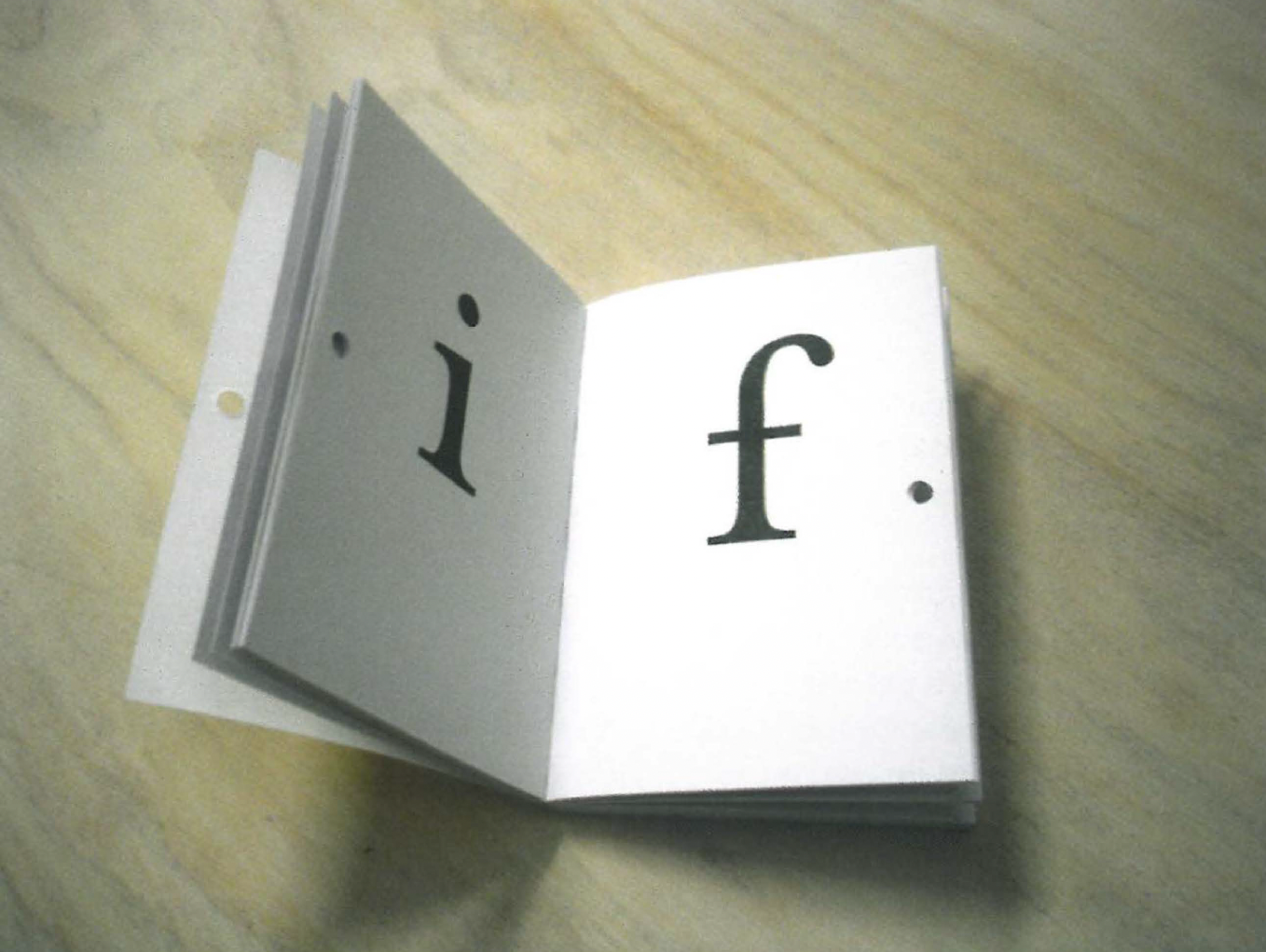
Phillips' wall based words letters for dad starts as a quiet narrative found as the front cover story of a nondescript paperback. The text describes a scene involving silent but familiar space between people - a daughter basking in the happiness of a father's attention, each with an agenda of time.
From here starts a journey revealed in large scale letters, one letter to each page of the paperback, installed across three gallery walls. The loosely connected, yet precisely placed text gradually forms a story of intense personal introspection. Each book, opened to the required letter, forms a long unhurried sentence that builds a tale in the best storytelling style.
letters for dad is the eighth issue in the spacer series, 'a quarterly forum investigating thoughts through design'. Each issue of spacer is diverse in format, ranging from personal reassurances to a friend written on public billboards, to self-help guides such as twenty six one-day projects to help you change the world.
tides apart demonstrates a strong and considered partnership between two artists from diverse design backgrounds. Each have contributed to a shared and carefully constructed physical and emotional landscape, one that matches the frailty of their real life invitation image.