"He could easily have had more wickets in that spell
He bowled without luck but he still bowled well
of the 38,000 that have been assessed
only 12,500 passed the fairness test"
from 10 Found Poems 2008 artist's book, Sean Phillips
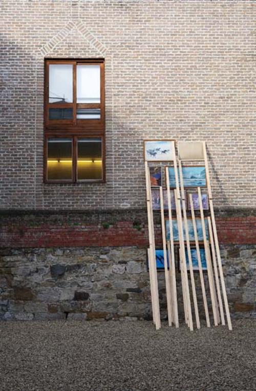
The exhibition, 'Oh that I were where I would be', of Sean Phillips’ text based artworks at Andrew Baker Gallery included wallworks of enamel lettering stencilled on aluminium and brushed steel, concertinaed white perspex objects with words engraved in black on each surface and small books presented in clear acrylic boxes. Phillips uses a range of techniques, from mechanical etching to handcut stencils. Everything, including the handmade works, is done with a precision that produces a machine-like finish. The aesthetic that Phillips pursues is reductive, minimal, smooth and deceptively simple. The only compositional form is the text, and there is nothing to distract us from that text. What remains is a delicate pursuit of a poetry of the everyday in the fragments of found quotes, the rambling broadcasts of sports commentators, truncated spellings and books on grammar. Underneath the finish and reserve of Phillips’ work is a lively humour, a sense of play, and love of language.
When we think about the way text operates within visual works of art there is no one defining practice. Richard Prince’s banal joke paintings might come to mind, Tracy Emin’s blankets or perhaps Colin McCahon’s biblical scrawl. More locally the work of Robert McPherson, Jenny Watson, Vernon Ah Kee, to name a few, show the great variety in the ways text is used within art. Words signify and they do so emphatically, as it is their sole function. While this directness of signification might attract artists to text, they may employ it earnestly or undermine it through irony and double meanings. For all the apparent directness of text in an artwork there are often veils of ambiguity. How does the text relate with the way the work is painted, made, or presented? How does the artist engage with the language and the script or typeface? How does the meaning in a sentence interact with the supposed meaning of the artwork? Furthermore the enunciative code is uncertain; is it the artist who is speaking, the work itself, or is it the source of the text? Is the text appropriated, is it a direct statement, or a question, or a critique of what is written?
Phillips approaches text from a particular angle. While the fragments are sourced from everyday life, his work does not fall easily into the genre of appropriation, pastiche and critique, but rather, draws on the history of concrete poetry. Pared away from its original context, the fragments ring of the physicality of language itself. There is an intimacy with and an interrogation into the structures of language that develops an unlikely poetry from grammar, syntax and style.
In 'Keep as one word / Hyphenate' (2008) there are two edited lists lifted from a grammar textbook of words that should and should not be hyphenated. On first encounter this work is exceptionally dry. However, as you read through the list, relationships between the words emerge, associations that are pregnant with the possibility of meaning, even narrative: 'Hardheaded Hardhearted Heartache... Heaven-sent High-handed House-dog'. Yet this possibility of meaning never fully reveals itself. The artist added one word of his own: 'U-ey', an Australian colloquialism that would not appear in an English grammar book. The word seems to speak of the range of associations on which this piece balances. Promising, but never delivering a coherent meaning to the selection of words, even the linguistic logic behind hyphenation remains obtuse.
In 'A - Z' (2008) the alphabet runs down the centre of the steel like the 'Zip’ in a Barnett Newman painting, anchoring the cropped, phonetically spelt words that hover, linked to each other only by a letter that forms the sequence of the alphabet. The words are difficult to decipher and failing direct signification, the tenuous narrative that might be there is overridden as they anchor instead to a structure of vertical symmetry.
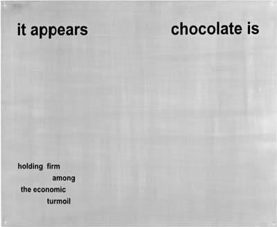
The pieces of text, as much as they are fragmentary, are also highly specific. Nothing is left to chance in these works. The selections are not random, but driven by a playful logic, wonder and fascination with language. The humour is subtle and warm. One work reads 'It appears chocolate is holding firm among the economic turmoil'. While the reductive surfaces hold little evidence of the human hand, it is in the humour that we find the presence of the artist, as he shares a pun, a play of words, or the accidental rhyming of a newsreader. The austerity of these minimal, monochromatic artworks is deviously undermined by this humour; the colour is in the language.

