I approached this Biennale, the ninth in the series, with some apprehension having heard that it was 'colourful'. I have nothing against colour. A certain cynicism towards the bland conceptualism of certain artists in the show made me hesitate to go at all. Yet it was free and I had a review to write so in I went. With a damp kind of expectation.
The first works I encountered on the staircase were Narelle Jubelin's petit-point images in light brown (ecru) resin Habitat frames set on top of rather neat black or beige plastic tooth-lidded ashtrays, also Habitat. I almost took one as they were not in a case or particularly well held down. This, I was told by Gallery Exhibitions Manager David O'Connor who browsed by, was the way the artist and curator wanted it and I know why, it was quietly daring in art gallery terms and it gave an instant lounge room rather than gallery feeling to the space.
It introduced some of the strongest and most meaningful elements of the show, nostalgia and retrospection. If only the daring evinced here had been kept up throughout the show – the best suggestion that comes to mind would be to have introduced a bit of hands-on relational aesthetics and have a secondhand retro clothes stall as a work and let people try and buy during the exhibition.
Each of Jubelin's embroideries took a detail from life in the 1950 - 60s of participants in this exhibition or related arts workers in the formulation of a kind of mythology of the unmythological. Thus we see in the tweedy grain of many tiny stitches an image of Ian Burns' wife Avril in one of the Mondrian dresses he designed for her in 1966, Jacky Redgate and her sister also in Mondrian dresses made by Redgate's mother at Henley Beach in 1967 and Anne Stephen in a Marimekko dress made by her mother in St Kilda. Most of the other images are of buildings – in Brazil (Vanila Netto's family home), in Mozambique (Angela Ferreira's first family home), in Egypt (Raafat Ishak's family home), a Seidler house in Sydney and one in Wahroonga, Anne-Marie May's family home in Lara, Victoria, and Callum Morton's family home in Toorak designed by his architect father in the 70s.
Thus an emphasis on modernism as imbricated in daily life, as houses, furniture, clothes, packaging and homewares, modernism as lived aesthetic rather than fine art, is introduced into the equation of the exhibition which is called 21st Century Modern and which claims to represent artworks which are part of a world-wide movement. Indeed curator Linda Michael quotes Frieze magazine of 2004: 'Modernism is back'.
As I write a large international exhibition on modernism covering all the arts is on at the Victoria and Albert Museum in London though it deals quite strictly with 1914 - 1939. Having taken the step of pointing towards the lived experience of the aesthetic of modernism it may have been rather wonderful to include more furniture and even fashion and graphic design in this exhibition but I guess that would be stepping away from the brief into design, craft and decorative arts and this is meant to be an art exhibition. Yet decorative arts are strong elements of the AGSA's collection and I suspect a more adventurous gallery may have done something like that very successfully in spite of squeals from purists. I guess John Nixon did include some of his ceramic collection.
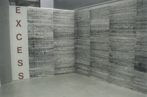
In recapitulating modernism some artists in this show have grown quite literal and their efforts are very much like art school projects and I feel should have ended up where art school projects tend to go these days – the recycle bin. That said, apart from flat colourfield paintings, apart from videos by Daniel von Sturmer which are like watching paint dry (though some people like them though they are unable to explain why), apart from the superficial or wrongheaded, apart from the anodyne or timid or bland, there were works and moments in the show which made me feel there was some point to it all and then subsequently perhaps to reconsider the previously disregarded, at least a little.
What truly and usefully is being investigated in the Biennial is the nostalgia and retrospection of the unheroic, the typical, i.e. the backgrounds of people who grew up in the fifties and sixties and for whom certain objects and colours, and books and ideas, have special meaning because they were introduced to them at an impressionable age and because their effect hasn't been discussed or theorised or examined but neglected and ignored. And they may just contain the unharvested fruit of something valuable and precious. Thus the manic color and energetic glow coming from Robert Rooney's paintings reminds us of his concern with suburbia and with suburban energy – here seen as a set of paintings inspired by Russian ballet and culture. I was taken to another site of memory and possibility by the little pile of books near Shane Haseman's three felt paintings.
These ten secondhand paperbacks were, like Jubelin's works, not placed inside a museum case or perspex box, but sitting naked on top of a plinth. These very copies of R. D. Laing's works were required reading with great influence in the seventies. Haseman was born in 1975 but clearly has a finger on a retrospective-gazing pulse – like his video of paper bag masks embellished with Malevich type designs, and ears, which he wears to do simple silly video tricks, tap into yet another vein of unexamined memories, the Bauhaus at pre-school, pre-school in the Bauhaus. Then there are the youngest people included in the exhibition in the collective Slave who also tap into kindergarten moments with felt and even playdough. Their work falters and fumbles, is often banal but touches on the same ground of unmythology, a recognition that our everyday, however slight, is something both ordinary and important, is history and exists in time.