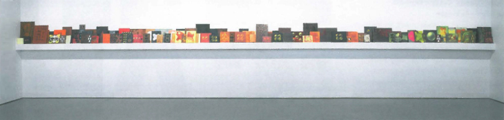
This show sees the return of Su Baker to Curtin University where she was an undergraduate 25 years ago, to complete a PhD in Creative Art. The main part of the exhibition is an installation of thirteen paintings in a large square gallery. I shall confine my remarks to this because space does not allow an account of the second room in which a number of small works act as a fascinating footnote.
These large square canvases have been hung touching each other in two groups. As you enter the gallery you are faced with nine canvases, while on the wall behind you are a further four.
I was immediately struck by the quiet authority of these works. They are of a consistently high quality. Most of them are in the warm part of the spectrum with glowing oranges smouldering against deep, dark reds or blacks. Two canvasses have a cooler palette of frosty whites and dark blues.
In order to get a better sense of these works I will discuss them in terms of three different aspects: process, reference and aesthetic. In reality of course these are not experienced separately but impinge upon and inter-relate with each other.
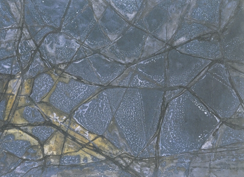
An awareness of the process of making the works connects us with the activity of the artist and the material qualities of the medium. In Baker's case the decision to paint on a stretched canvas laid on the floor is crucial to the form of the images in this installation. The crossed centre pieces of the stretcher divide the canvas into four quarters into which there is a natural tendency for liquid paint to pool under the action of gravity. This is the reason for the recurrence of four-fold imagery in these works.
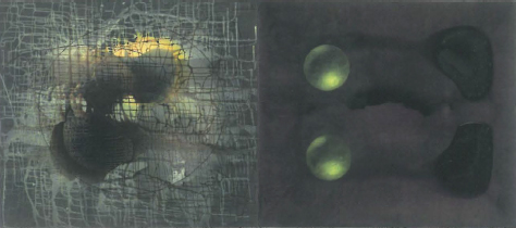
As the liquid paint dries in differing rates there is a natural craquelure that crazes the surface and also produces contours of differing colour like those that surround the salt lakes of the Australian desert. In saying this I am already talking about reference. The paintings hover between representation and abstraction maintaining a finely held tension between the two. The subtle variations in tonality suggest a deep pictorial space, the illusion of a represented cosmic space inhabited by inter-stellar gases which coalesce around certain gravitational forces and at other times are thinned almost to non-existence by the vast distances of vacuous space. This tendency to form images is so insistent in some paintings that it produces an explicit imagery of spheres and the forces that influence them.
If we are reduced to incomprehension by the vastness of cosmic space we are also without the ability to imagine the smallness of fundamental particles in which the universe is curiously mimicked. Su Baker's images touch both of these possibilities and in doing so bring us into the realm of the sublime in which human ability to master an ultimate understanding of the universe is called into question. She rejects any idea of specifically determined meanings however including the spirituality which haunts these works.
United with meaning is the sheer enjoyment of our sensory response to these paintings. The subtlety and evident mastery of effect has at best a quiet commanding authority that is quite thrilling. There would really be no point in these paintings without the pleasure they afford us. As the title of this exhibition implies, it is the presence and the quality of this pleasure that give seriousness to these works. Meaning in the visual arts devoid of aesthetic can become trivial, a series of rational connections that cannot escape their essential superficiality. The value of these works lies specifically in their sensory affect upon us, in the way in which meaning is fused with our feelings so that our experience of these objects and the pleasure they give us goes beyond what can be said.
On the wall behind you as you look at these works are a further four canvases. These are in acid yellows and maroons and so act as a counterpoint in a minor key to the main body of work. They are like a question mark hanging over the affirmative major key of the nine canvases opposite. They are for me like a counter-argument, an anxious doubt posed by the intellect, questioning the value and validity of the experience of the body. It is this question mark that is central to the anxiety of modernism.