Perth born Jurek Wybraniec has been named one of the 50 most collectable artists in Australia. Daniel Gottin is based in Switzerland where he has a strong public art profile. Both artists maintain highly regarded international reputations, and exhibit regularly in Australia, USA and Europe.
This exhibition demonstrates how well the artists collaborate, in their ideas and employment of industrial materials and mass-produced products, to create visually intriguing exhibits that take viewers along intellectual avenues of art.
There are certain physical and visual characteristic in the media selected: the transparency of adhesive film, texture of different tapes and gloss of spray enamel. These attributes are recognised then rediscovered when the practical product is used to create a contemplative work of minimalist art. We appreciate the object as much as the concepts and contradictions it evokes.
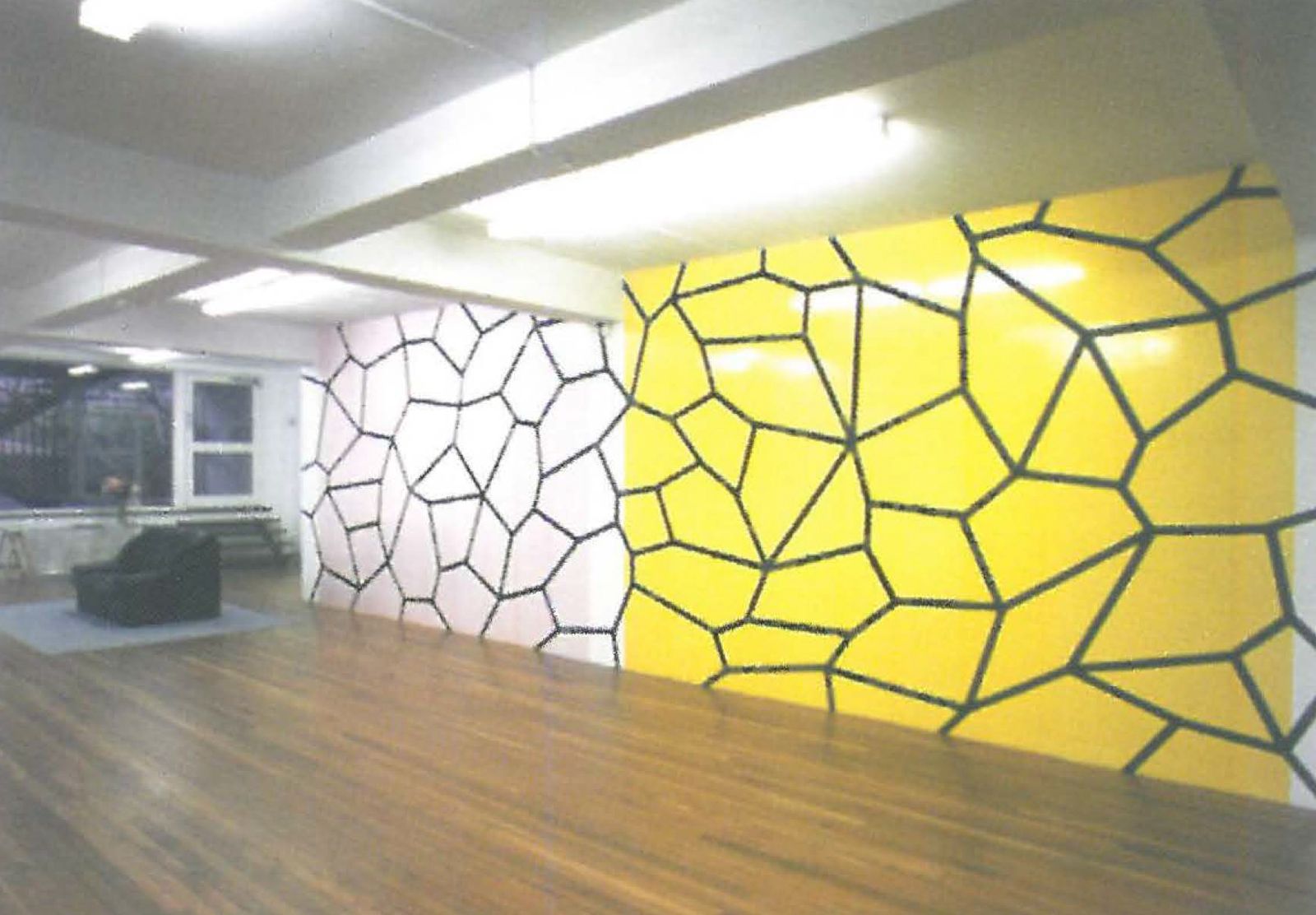
For example in the collaborative exhibit Network P&Y Combo, one wall of the gallery is divided in half from floor to ceiling by adhesive film, pink on one side yellow on the other. It is applied in strips defined by the length and width of the product. The transparent material tints the white wall accordingly and where the strips overlap the colour is a tone darker creating lines to suggest a structured rectilinear grid. Small air bubbles trapped behind the film and tiny imperfections on the supporting wall seem magnified as the sheen and hue of the film accentuates them. Over the film, connecting the cool pink and warm yellow halves of the wall, matt black textile tape is employed as thick straight lines that draw oblique shapes connecting in a more organically inspired web-like pattern. Thoughts of microscopic cells defining human tissue, the shell of a tortoise, a honeycomb, race through the mind. We soon appreciate how the creative manipulation of simple functional material can translate the act of looking into the art of seeing.
This visual transformation is repeated with each exhibit as it takes us toward another level of art appreciation and activates a different interpretation in the mind. Every exhibit has a basis of calm rationality yet each can evoke an expressive reaction from the spectator. Gottin's presentation Untitled (Nr.11) involving 56 sheets of metallic grey A3 size paper and blue adhesive tape exemplifies this concept. Every piece of paper is mounted with exactly the same amount of space between them on all sides. This alignment creates a positive (grey paper) and negative (white space) grid pattern of mathematical precision. Then blue tape is ripped from the roll into four uneven strips to hold the papers in place at each corner. These strips form spontaneous squares but they're not neat, corners don't meet and they're at odds with the perfection they support. The blue tape takes on a calligraphic quality of controlled emotion as opposed to the cool formal paper squares. The installation and its variety of interpretations begin to dance in the mind while the physical object remains still.
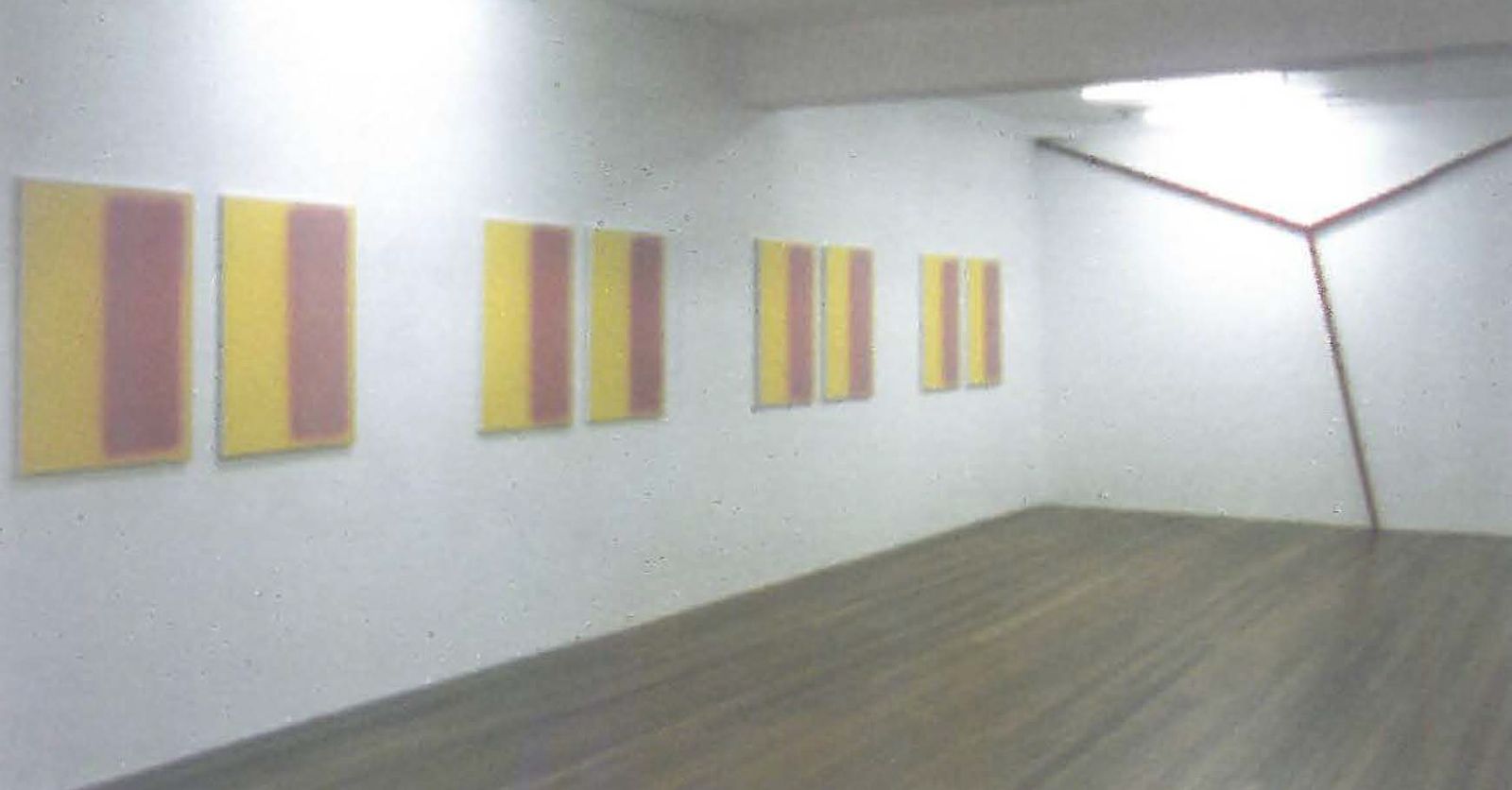
To an extent Wybraniec's four pairs of paintings The Painting and its Double (Despair, yellow + pink combo) provides the same visual and mental vacillation. Each stretched canvas is spray painted with yellow enamel and wears a vertical rectangle of pink enamel on the right side. At a glance they appear to be one set of paintings, repeated four times. Viewing each pair has us responding to the artwork as we do with twins; we search for differences, unique attributes that can be found in one but not the other. In that frame of mind we investigate and compare surfaces to discover they are not identical. A tilt of the head a step to the side reveals yet another subtle difference between the paintings. The more we engage with the work the more we see.
Both artists extend the innate sensual qualities of their selected media and as a result these inexpensive, store-bought products are considered with the same awe one might save for precious gold leaf or rich brocades. We are reminded how any material can be used to make art and that all visual art is first an object, simple or complex, which when viewed will alter our preconceived ideas.
This concept is best expressed in Gottin's installation of three 4 x wooden beams painted red on one narrow side. These simple pieces of timber are wedged between ceiling and wall junctions and the floor to form a Y, each dependent on the other. It's precarious but all things being equal, it works beautifully.